The x-axis represents the score determined by the binary classifier. The bell-shaped distributions in red and blue represent the actual classes of the data samples. The white bar in the left panel can be moved by the mouse and represents the threshold that the user decides to use to classify the classes.
The ROC (Receiver Operating Characteristic) curve displays the performance of a binary classifier for various thresholds. The performance of binary classification is expressed using two metrics, the True Positive Rate and the False Positive Rate.
In short, the ROC curve represents a better classifier when the curve is closer to the upper left corner.
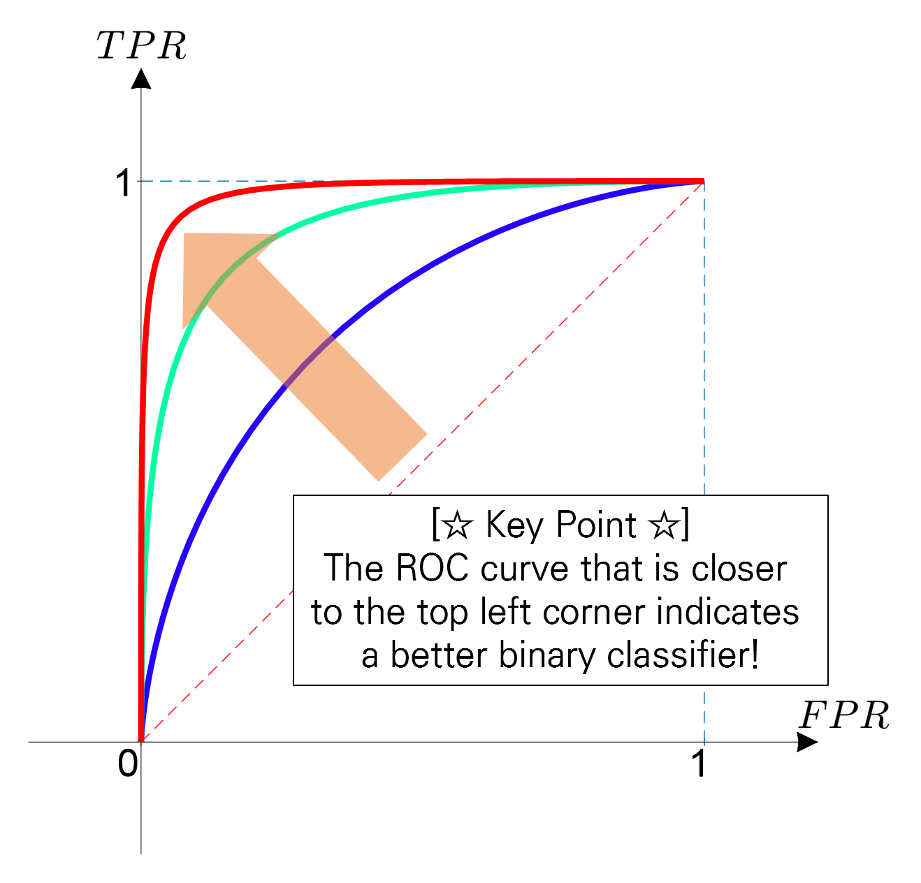
Figure 1. The ROC curve represents a better classifier when it is closer to the upper left corner.
To understand the ROC curve well, it is good to understand the three characteristics shown in the ROC curve plot:
- True Positive Rate and False Positive Rate
- What does a point on the ROC curve mean?
- What does the degree of curvature of the ROC curve mean?
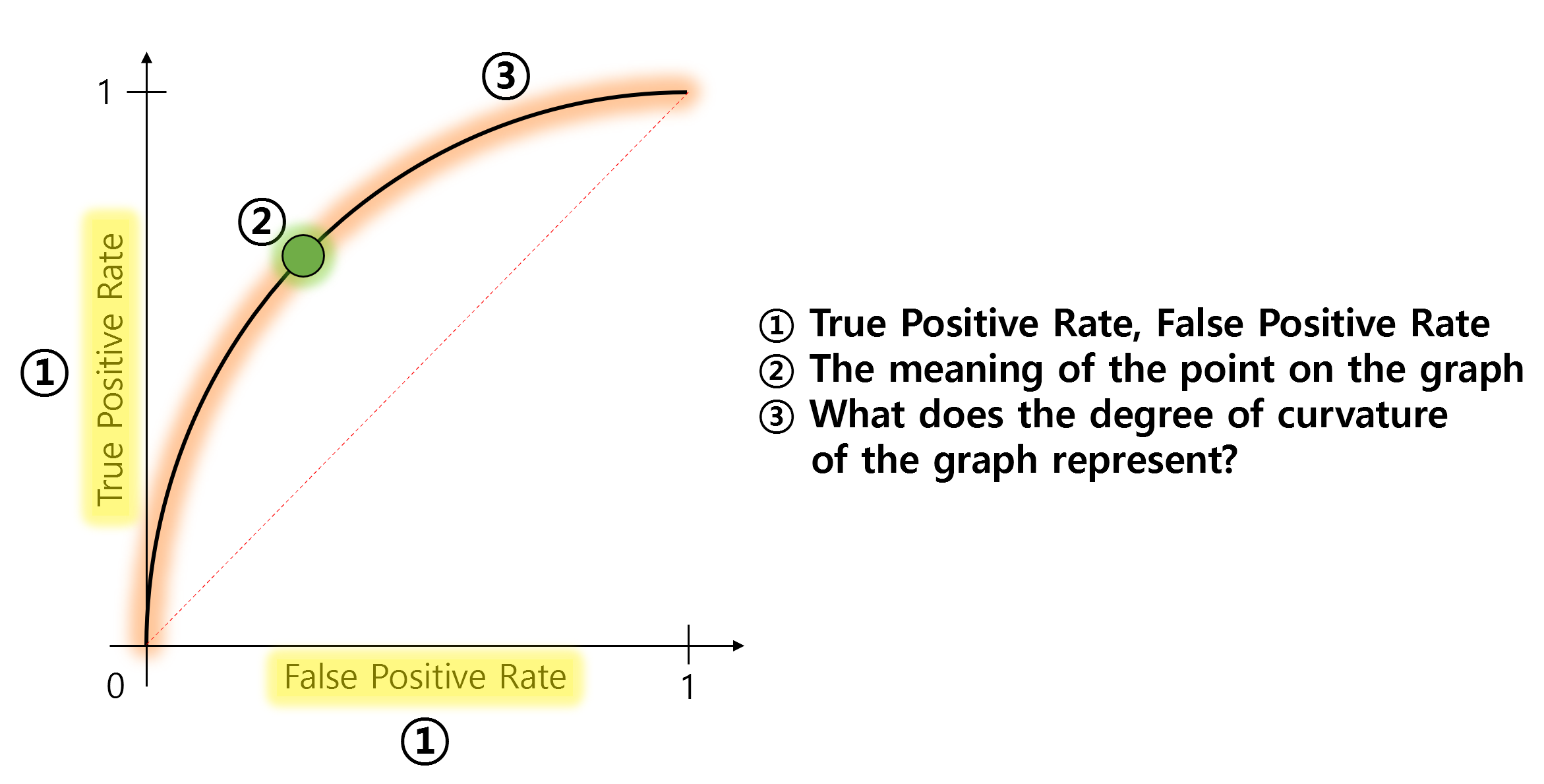
Figure 2. What you need to know to understand the ROC curve.
True Positive? False Positive?
The False Positive Rate (FPR) and True Positive Rate (TPR) represent the values displayed on the x and y axes of an ROC curve, respectively.
Here, we can observe that both FPR and TPR share the common word “Positive”.
The meaning of “Positive” is that the classifier judged “yes”.
For example, if a patient goes to a hospital to undergo a cancer test, and the doctor (i.e., the classifier in this case) judges “the patient has cancer”, then that is a positive judgment.
So, what do True and False mean?
True and False represent whether the judgment was correct or incorrect, respectively.
In other words, True Positive means that the person actually has cancer and the judgment is correctly made as positive, while False Positive means that the person does not actually have cancer but is incorrectly judged as positive for cancer.
We can visualize True Positive and False Positive as follows:
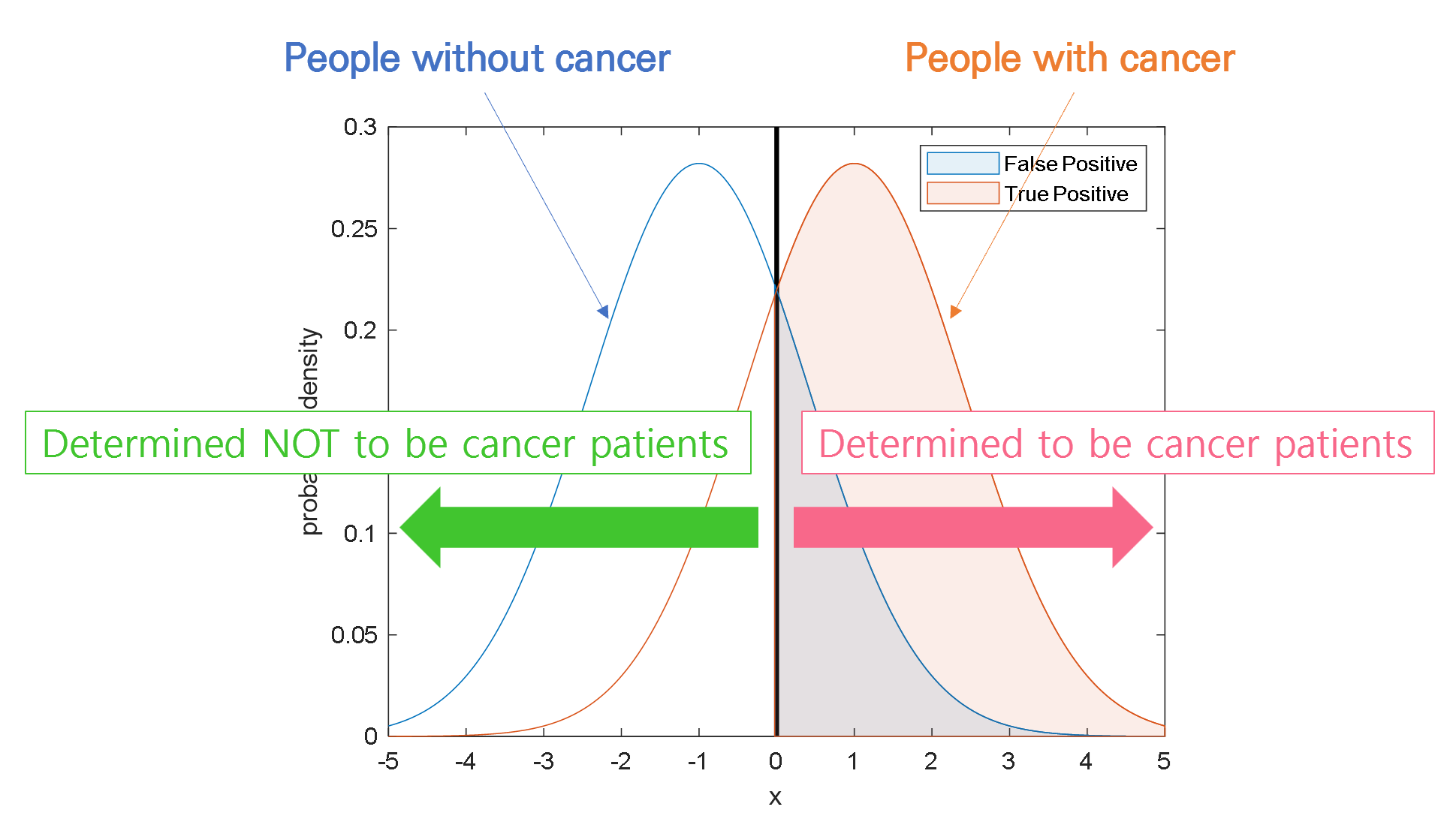
Figure 3. Visualization of True Positive and False Positive
Relationship between TPR and FPR
Now let’s focus on the characteristics and skills of the doctor (i.e., the binary classifier).
Let’s say Doctor A is fearless and impulsive, and judges all patients as cancer patients.
What will happen then? As a result, not only the patients with cancer are all judged as positive (i.e., True Positive Rate increases),
but also the patients who do not have cancer are all judged as positive (i.e., False Positive Rate also increases).
This can be visualized in the following figure. Judging all patients as patients with cancer means that the threshold is set very low.
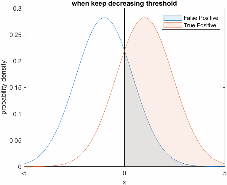
Figure 4. Changes in True Positive and False Positive ratio when the threshold is set very low, like Doctor A who is fearless
On the other hand, Doctor B is very fearful and judges that all patients are not cancer patients. In other words, Doctor B judges not only the patients who do not have cancer, but also the patients who actually have cancer, as negative, resulting in a decrease in both True Positive Rate and False Positive Rate.
This can be visualized as follows. Judging all patients as normal means that the threshold is set very high.

Figure 5. Changes in the True Positive and False Positive rates as the threshold is set higher, as shown for the cowardly doctor B.
What does the point on the graph mean?
As we follow the discussion above, we can see that the values of False Positive Rate (FPR) and True Positive Rate (TPR) change depending on the variation of the threshold.
Moreover, we can also understand that FPR and TPR increase or decrease proportionally to a certain extent, regardless of whether the threshold is set higher or lower.
The point on the graph represents the intention to investigate all possible FPR and TPR values for each threshold, regardless of the current binary classifier’s classification performance. In other words, it means to find out the ratios of FPR and TPR for all possible thresholds and plot them.
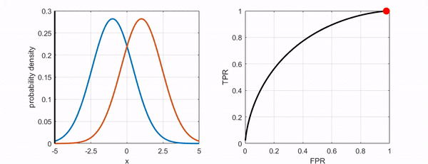
Figure 6. Changes in the position of the point on the ROC curve as the threshold varies.
What does the degree of curvature represent?
Now let’s find out what the degree of curvature means.
As shown in the following figure, if we can distinguish the two classes better, the ROC curve moves closer to the upper-left corner.
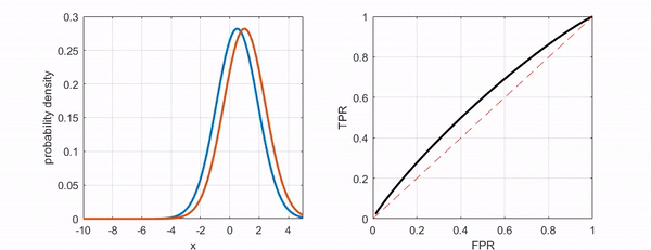
Figure 7. The ROC curve moves closer to the upper-left corner as the two groups become more distinguishable.
Conclusion
In summary, the ROC curve is a curve that represents the performance of a binary classifier, and it shows the ratio of FPR and TPR for all possible thresholds.
Ultimately, a ROC curve that is closer to the upper-left corner indicates a better binary classifier. As a professional math blogger, it is important to understand the concept and meaning of the ROC curve to communicate effectively with your audience.